There are great websites out there that can give you the history of commercial illustration with facts and figures. What I’m going to do is break business art and design down according to the key points that pertain to how human beings understand imagery.
Here it goes:
Humanity forms.
People gather in communities, creating the need for communication.
History gains context as generations pass and the need for written communication develops.
Illustration becomes primal and necessary.
A long time passes, and some really smart people invent the written language.
Written language can only be understood by the wealthy, while the lower class keeps a hold of illustration.
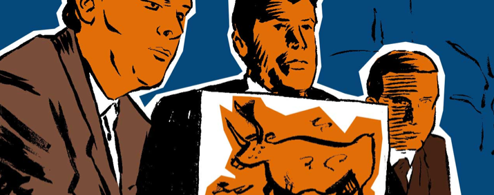
Since the few are wealthy and the many are poor, the wealthy still use illustration to communicate with the masses (think cathedrals, statues, ceramics, etc.).
The Industrial Revolution happens, and within a hop, skip, and a jump, we have access to printed text, mass literacy, and centralized communication processes.
The golden age of this new kind of media is glorified in Mad Men, where we see a world in which the act of writing for composition has become part of the curriculum, while the art gets pushed out of general practice. You only see it in subcultures and the limited “fine arts” communities. But in advertising, the merging of writing and art weirdly becomes central to prosperity.
And then the collapse. In the 1960s, we saw the rise and fall of the commercial utopian dream. We had mass saturation of imagery. It’s hard to imagine a world where the main source of information was just relegated to a single television in your house with three channels, the newspaper, and radio. That was it, though. Illustration was king for a while within this commercial utopia. It became a commodity. With the ability to make multiple prints of a work, the artist became disposable, and single images became oversaturated in the public consciousness.
OK, so skip ahead a half century to today. We have no central communication. Everybody watches what they want, when they want, where they want, and how they want. There is no centralized process of media exposure. Can you imagine a cartoon character like Mickey Mouse being created today that has the same kind of widespread recognition? No! It would never happen. There’s no way to get kids – and their parents – to all watch the same thing.
The knee-jerk reaction is to get rid of investing in illustration. Keeping up with the Joneses today seems to mean getting a subscription to a stock photography site, hiring workers cheap, and pumping out as many new Facebook posts as possible.
What if you went the other way? What if you slowed down and focused on creating a unique, recognizable image that reached the core humanity of your consumer base?
Take Spike & Reggie LLC, for example. Six months ago, this client approached me to design them a logo. When I inquired about the meaning behind the name “Spike & Reggie,” I was given a completely personal story that was way too complex for a three-second impression needed to be given by an initial pass of the logo. I immediately thought of Saint Archer Brewery as a brand that had a similar design problem.
The story did reveal qualities about the company: Quick, upbeat, responsive, familiar, trustworthy with a little edge. It got me thinking of who “Spike & Reggie” were, and after poking around on the web, I found a concept that had been abandoned since it was overdone in the Seventies: the sports mascot. With a little study of Tex Avery, the characters Reggie the dog and his sidekick headphones, Spike, were born.
There was a time when the mascot was king in every brand. But when everyone had it, no one wanted it anymore. And, bingo, where there has been abandonment, I have now found an opportunity for my client to have a unique brand illustration that brings about a powerful nostalgia.
Business art and design styles from the past, due to their saturation, are widely unused. Much like the Spike & Reggie illustrated mascot, many business illustration methods of yesteryear have been abandoned and are ripe to be resurrected.
Now, I am not saying go out and get a mascot. What I am saying, instead, is to be open to the past for models that were once successful. Maybe your business needs a really amazing comic book or an animation.
Whatever you’re doing, make sure you aren’t just trying to keep up with what everyone else is doing to move forward in your business. You can’t win that way.
Wayne Gretzky once said, “A good hockey player plays where the puck is. A great hockey player plays where the puck is going to be.”
To know where the puck is going to be, you definitely need to know where it has been.
And if you’d like to step up your content marketing so that articles begin incorporating graphics and engaging visuals, hire us.


