Use blog illustrations and visual storytelling in business to use fewer words and evoke a more human response.
The way companies do business has shifted so dramatically during the past decade that we now see corporate websites and blogs all looking like entertainment websites and blogs. The human eye can now conglomerate businesses graphics into categories and gloss over them easily without ever receiving all of the intended information. This is in large part due to the media saturation of the web that has fragmented any standardized way of communicating with consumers.
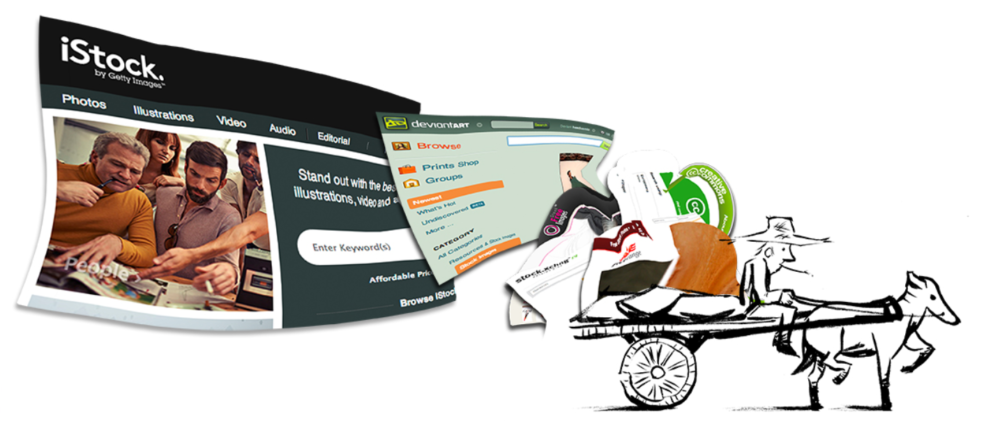
Visual storytelling is new for business. Businesses are used to paying a few bucks for stock photography and calling it a day, but some stock photos, especially the ones that are overused across the web, can actually take away from your content rather than lifting it up. Your readers see an image that they’ve seen on a different blog and their brain tells them this is something they’ve also read before.
So, how do we connect with consumers in a meaningful way? Where do images come from that can make people stop and pay attention? The answers to those questions are complex, but figuring them out has become more fun.
How Visual Storytelling Humanizes a Business
In 2010, I had just began my first ever webcomic series, titled “Hipster Picnic,” and it was moving along with success. I had envisioned the comic to be a weekly strip that would combine snarky hipster satirism with zombie fiction. I was quite happy with the results. The comic had some legs, and as I trudged through those first several weeks, I made a startling discovery about the role that illustration and imagery can play in business.
It was on my eighth page of work that I decided to veer away from character establishment and look at a local business.
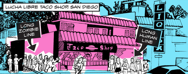
Recently, my friends and I had been frequenting Lucha Libre Gourmet Taco Shop. Lucha was a small place that had a limited menu of typical taco shop items twisted into original creations in an environment filled with wall-to-wall Lucha Libre paraphernalia.
When I first patronized the shop in early 2010, it was sparsely attended. By the time I went back for second helpings in October of that same year, the line to get in was so long that we decided to go elsewhere. Apparently, Lucha had become the darling of several local television stations, and word had spread of its tasty fare.
A panel from the Hipster Picnic webcomic “Long Lucha Lines”
I promptly made a comic about Lucha and its long lines.
When I posted it to my Facebook page, it became an immediate hit, and not because of the fact that it was a well-done comic, but because I tagged the Lucha Libre Facebook page. They changed their Facebook photo to the comic image and even wrote me a note saying I could come in any time for a free burrito. The image was shared by a plethora of Lucha devotees, and I even received new readers for my fledgling comic.
The art of visual storytelling worked, even in business. Especially in business.
It was then that I began to understand imagery and advertising had shifted. In the early 2000s, I was enrolled a degree program for graphic design. In 2003, the adage was to design around the business; imagery had to be clearly autonomous and specially designed for the company. But something happened between 2003 and 2010 that changed the shape of graphic design: Design tools became accessible to everyone.
When the tools of the trade became accessible to everyone, it upped the ante for businesses to create meaningful taglines to rise above the rest. Gone were the simplistic days of Nike’s “Just do it.” As Seth Godin posited in his famous Tribes TED talk, “It’s about leading and connecting people and ideas.” Meaning exists when we create these kinds of narratives for the consumer to connect to on multiple levels. If anything, the success of the Lucha Libre comic proves this to be true.
What happened was that the comic effectively formed a narrative within a narrative.
First, it was a genuine creation for my own webcomic, which, for all intents and purposes, was purely artistic. This is a huge plus on the web, because there are so many people out to make a buck, and it’s hard to tell the difference.
Second, the business of Lucha Libre was now becoming a narrative in and of itself within the local community. When they joined forces, something magical happened, not only for me, but for the owners of the shop and the patrons equally. “Look, there’s a comic about my favorite taco shop! The lines are long, har-har.” This means the patrons, who are in on the joke, now are able to laugh at it together. An advertisement that was never intended to be one – that doesn’t feel like one – now has become one.
The question for businesses right now is this: What kinds of narratives are your visuals forming for your consumers? Are they meaningful or run of the mill?

