

I’m a comic book artist, and that means I think about blog typography in a very different way than most.
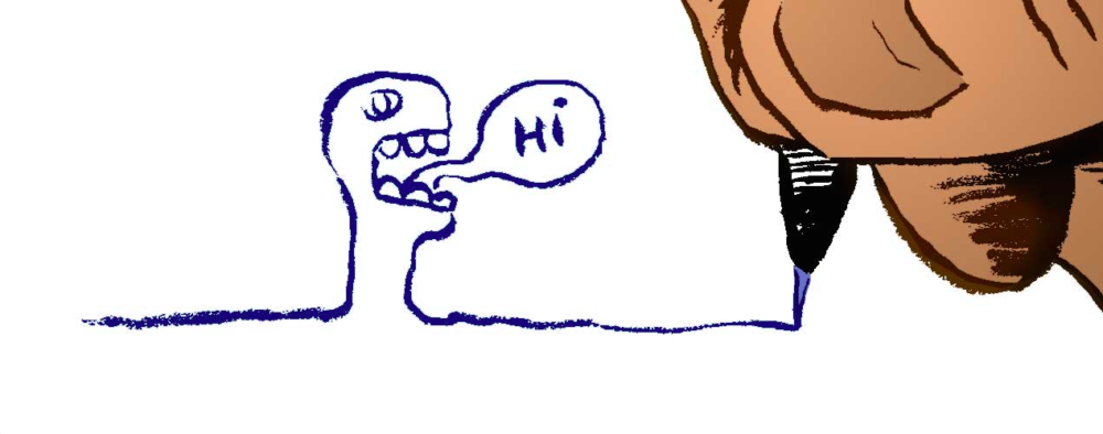
Comics rely on typography – or what they call “lettering” in this biz – to an extreme that most people would never have considered. What makes a fist punch onomatopoeia “POW!” the right way? Well, I can tell you it’s a combination of quite a few things.
There are countless lessons that can be learned by the magnanimous Richard Starkings at his site BalloonTales.com. When I talked to him several months ago, he shared with me this simple graphic he put together that I feel condenses an entire semester’s worth of learning into one small square. Simple and perfect. What to take away as you look at an infographic like this is the incredible amount of brainpower that goes into the simple act of designing a font and thinking about typography.

You might be asking yourself: “Why do I need to think about blog typography this much? I’m running a business, and this is what I hire designers to do for me!”
Here’s the important thing that you need to know as a business owner: Can you tell how much your employees know about font design? Can you tell if your designer really has an awareness of the font/typographical decisions and the impact of those decisions on your business?
In 1994, Microsoft designer Vincent Connare did not understand the nearly two-decade struggle he and his employer were going to face after the release of Comic Sans MS. I am convinced that if Connare had connected and collaborated with Starkings on any level, the Ban Comic Sans movement might have been avoided altogether.
The Comic Sans MS bungle is the exact reason an article like this is important for you as a business person. Believe it or not, it was not just the fault of the artist for the onslaught of calamities that the release of the Comic Sans MS font brought to Microsoft when it was packaged into the brand structure of their software. The designer had an accomplice, and arguably a ringleader, and it was the business owners and project leaders that skipped a very important step that led to a mistake that competitor Steve Jobs would have never made.

Know some things about blog typography before you hire a designer. Know how to spot good typography and lettering. Go to Tumblr every once and a while and look through their typography hashtags. When starting a new project, utilize Julian Hansen’s typography infographic before hiring someone so you know exactly what you are looking for. Keep an eye on the Instagram feed of typographyinspired. (And hire someone who posts their art there!)
Before you do anything, learn, at the very least, what the difference is between the major font families (serif, san serif, script, etc). Hey, if you really geek out on typography, I might even recommend taking a Skillshare class.
The bottom line is this: Learn to know what you’re asking for. We live in a world where the true test of your designers is their ability to keep up with your needs. Choosing the blog typography for your business needs is going to have to be a collaborative venture between design and business. It’s your job to articulate the vision; it’s your designer’s job to make it look amazing.